

Frutiger Aero: The Iconic 2000s Tech and Corporation Aesthetic, and its Sub-genres.
Written by Nataly Ornelas
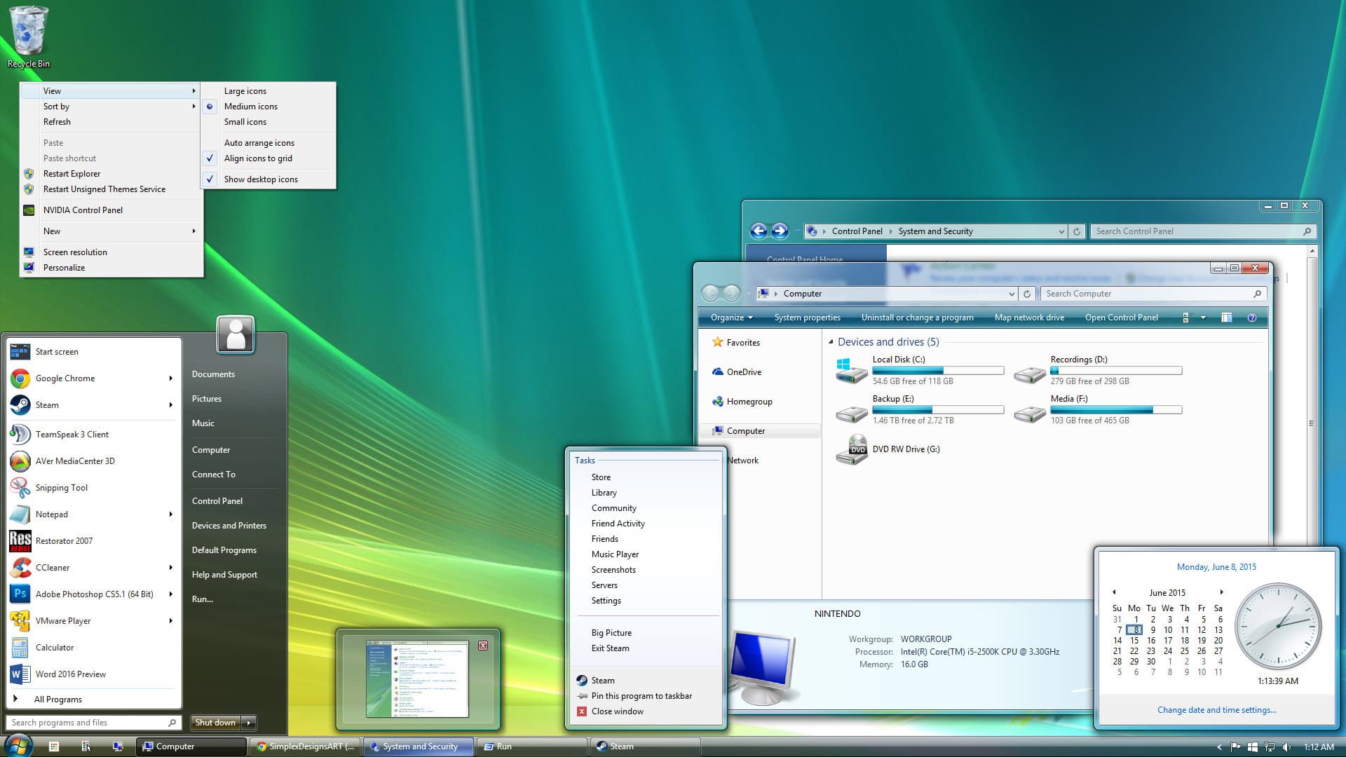
It’s 2007. After a long day at school, you’ve come home to try out the new Windows OS. You sit down on your good-old ergonomic chair and scoot up to your wooden desk, booting up your bulky PC and monitor. After a minute of watching the agonisingly slow loading screen, you are greeted with a light jingle, a skeuomorphic Windows logo, and vibrant greens and blues…
Vibrant colours, glossy, three-dimensional textures, bubbles, tropical fish, and corporate skyscrapers are all descriptors for the Frutiger Aero aesthetic and design, which promised us a future that seamlessly combined vivacious nature and cutting-edge technology. Beginning around 2004, the refreshing and futuristic aesthetic was created to smoothly integrate technology into our world.
A successor to the Y2K aesthetic, it contains low-poly textures, gradients, and futuristic elements. In addition to those adopted elements, the aesthetic also consists of glossy textures, tertiary colours, bubbles, lens flares, sparkles, and nature. Despite its start in 2004, its roots date all the way back to 1976, with the “Frutiger” font, created by Adrian Frutiger. Of course, companies wouldn’t use this font until the early 2000s, and the aesthetic’s term wouldn’t be coined until 2017 by Sofi Lee.
Its key users were Asadal Design, Apple, Nintendo, and Microsoft. Especially Microsoft. Microsoft Windows’ “Windows Aero,” shown significantly in Windows Vista (2007) and Windows 7 (2009), brought immense love and attention to the iconic aesthetic. Windows Aero consists of a transparent, yet three-dimensional and glossy UI design, and the font “Segoe UI,” classified as humanist, or “old style.” The “aero” in Windows Aero also contributed to the name of Frutiger Aero. Despite the rather dysfunctional and glitchy operating system, many users of Windows Vista and Windows 7 fell madly in love with the design, which brought popularity to the design and aesthetic of Frutiger Aero.
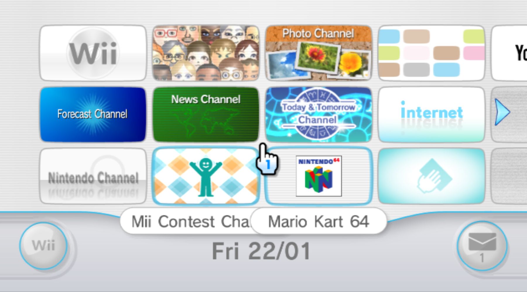
Windows wasn’t the only company that brought popularity to it. Nintendo’s Wii console and its games, such as Wii Sports, are quintessentially Frutiger Aero. It consisted of glossy 3D buttons, vibrant and tertiary surroundings, and futuristic fonts. Even the OST is representative of the aesthetic, with it being in many Frutiger Aero playlists!
With the many defining features of the Frutiger Aero aesthetic, it also has a variety of sub-genres. Consequently, people have increasingly begun to mix up the aesthetic with its subtypes and neighbouring aesthetics — the primary ones being: Frutiger Eco, Helvetica Aqua Aero, Y2K, and Floral Metro.
Frutiger Eco is a sub-aesthetic of Frutiger Aero that revolves around renewable energy, sustainability, and futurism. Its most prominent features consist of solar panels, water, futuristic architecture, earth, and nature. The colours that are primarily used in this sub-type are green, yellow, teal, and white. Like Frutiger Aero, this aesthetic gained popularity in the early to mid-2000s, with its end being around 2017.
Y2K is the aesthetic that was precedent to Frutiger Aero and is typically used as an umbrella term for all aesthetics existing in the 2000s, such as McBling, Scene, Cybercore, Cyber Glacier, and Synthwave. The Y2K aesthetic that typically gets mixed with Frutiger Aero is Cybercore, a retro-futuristic style with the motif of “a future that never was.” Originally known as Y2K before its semantic shift, the aesthetic consists of the following elements: CGI designs in the shapes of blobs, chrome, silver, and blue colours, futuristic fonts, and three-dimensional objects. The aesthetic began in the early ’90s and died around Frutiger Aero’s emergence.
Helvetica Aqua Aero is another sub-genre of the Frutiger Aero aesthetic which is characterised by its aquatic features. It is essentially Frutiger Aero, but its primary focus is on aquatic life rather than technology. It features tropical fish, vibrant blues, greens, teals, lime greens, lens flares, sparkles, and bubbles. This aquatic aesthetic is the one that is most commonly mixed with Frutiger Aero, typically because of misinformation and their fairly similar elements.

Floral Metro, also known as Vectorflourish, is an aesthetic that is part of the Frutiger family but not categorised as a sub-genre as of now. It is most closely related to Frutiger Metro and is the parent of Vectorbloom and Vectorgarden. It is known for its floral patterns, butterflies, bubbles, and flat images. Despite being mixed up with Frutiger Aero, this aesthetic typically holds a flat design, rather than a glossy and three-dimensional one. This style began in the early 2000s and powered through all the way until 2018.
So, coming back to Frutiger Aero, I am presented with two burning questions: why has it recently risen in popularity, and what is its nostalgic significance? Well, it is known that Gen Z has a tendency to think about the past, as well as categorise things into aesthetics. Whether it be Coquette, McBling, Kawaii, or Dreamcore, most teenage and young adult TikTok users have a specific aesthetic they stick to and know about the various types. While travelling down a road of nostalgic aesthetics, such as Nostalgiacore, Vaporwave, and Y2K, many people uncovered the hidden Frutiger Aero aesthetic. It evoked many nostalgic and joyful emotions, as Gen Z grew up in the 2000s and actually lived through the aesthetic, making them think of simpler times. As a result, people began to spread it around like wildfire, until it became an internet trend.
Enjoyed this story? Support independent gaming and online news by purchasing the latest issue of G.URL. Unlock exclusive content, interviews, and features that celebrate feminine creatives. Get your copy of the physical or digital magazine today!

")

")


")


